

Mind Matters
a final class project for a visual communication design course, requiring a multi-asset design solution for Brain Injury Connections of the Shenandoah Valley's Mind Matters program,.
Objective
design five deliverables with a cohesive visual identity for the BICSV's Mind Matters program that communicates youth concussion awareness in a way that feels approachable to students while remaining clear and informative for parents, teachers, and coaches
Client
class project, SMAD 332: Visual Communication Design, James Madison University, working with Brain Injury Connections of the Shenandoah Valley for their Mind Matters program
Target Audience
secondary education youth, specifically students from 3rd grade through middle school, along with the parents, teachers, and coaches who support them
Deliverables
character logotype
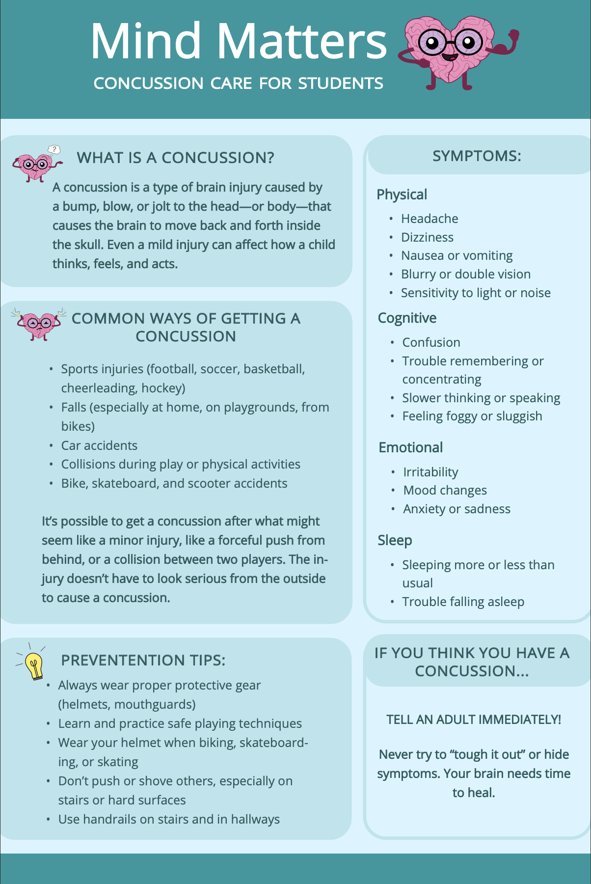
informational poster
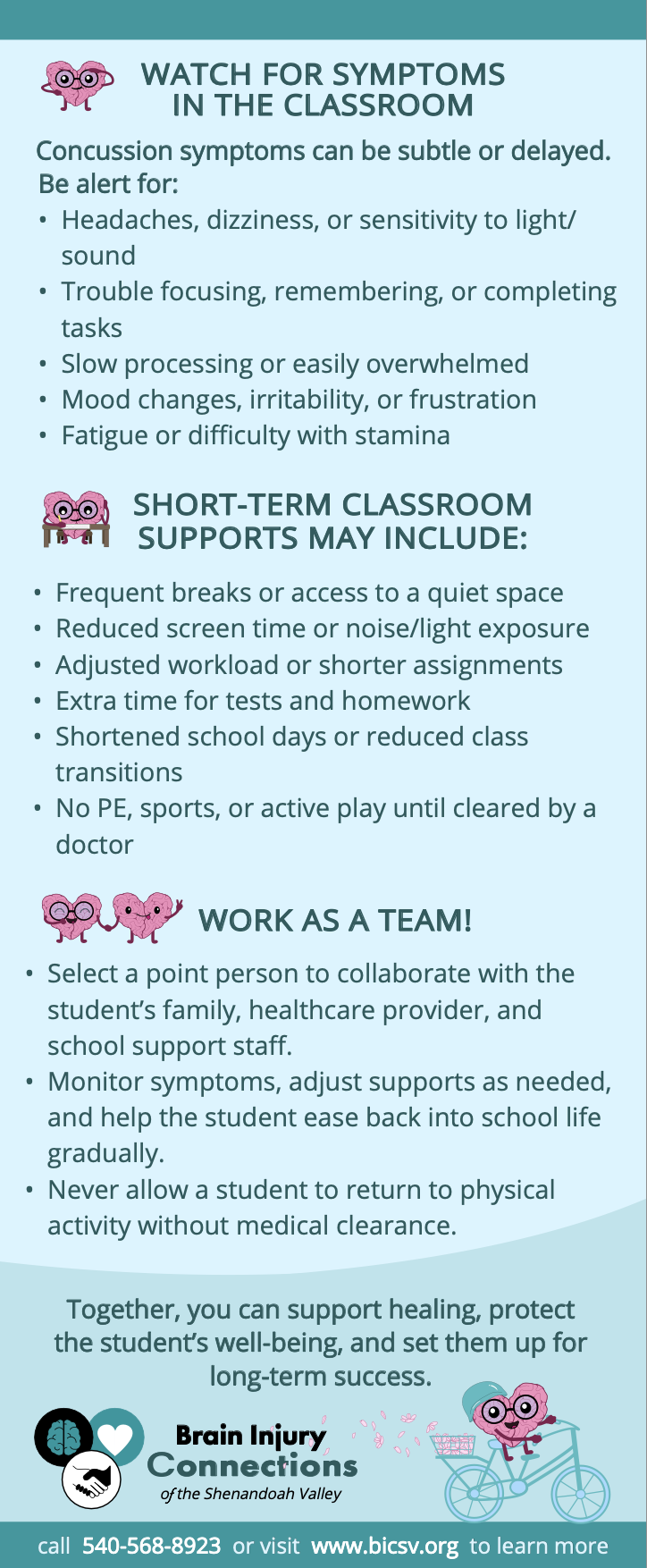
double-sided informational rack card
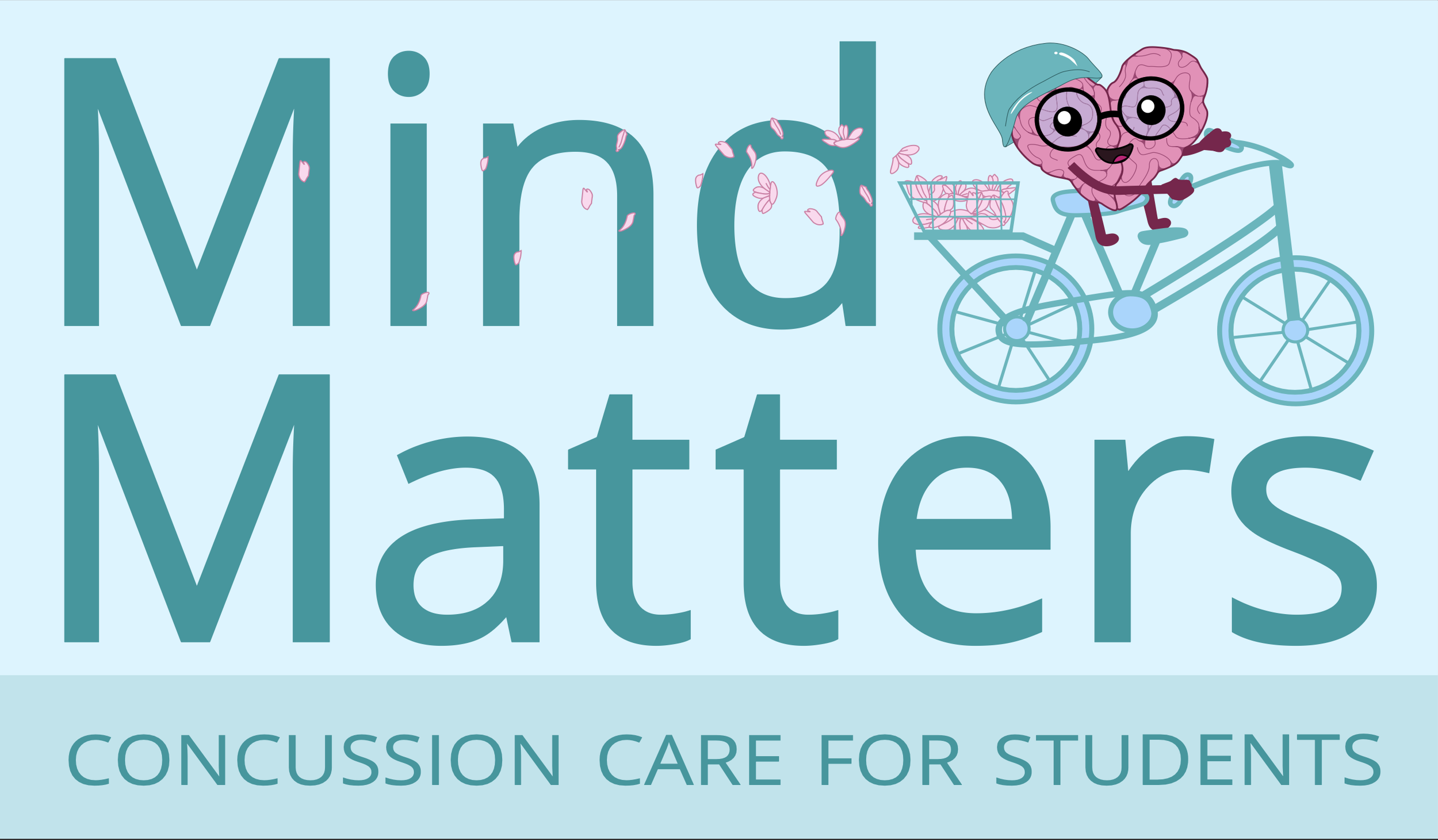
sticker design
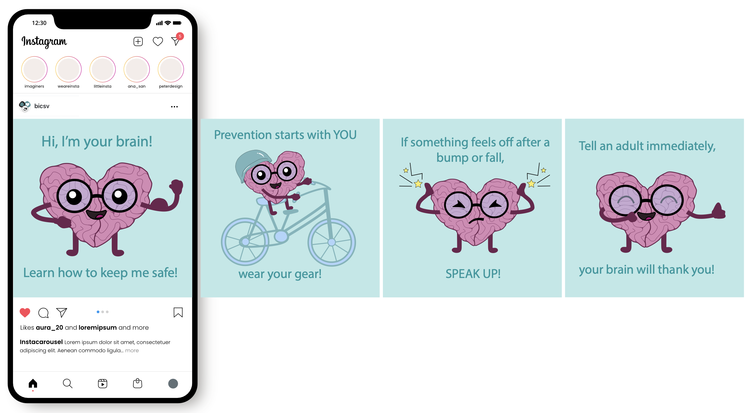
instagram carousel post
Final Products
programs used: Adobe Illustrator, Adobe InDesign
Character Variations
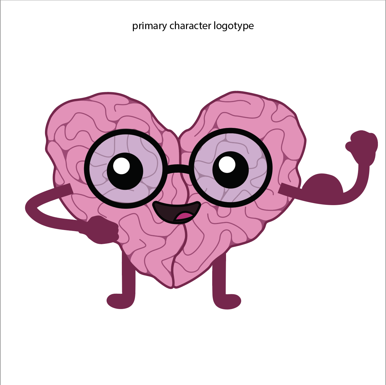
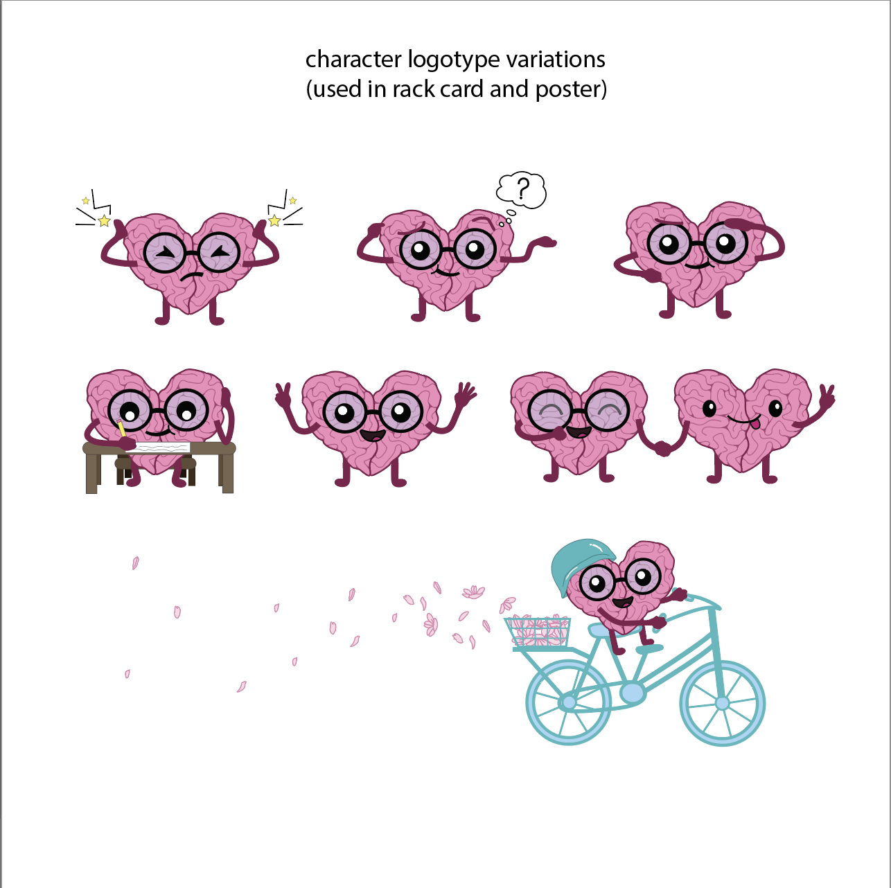
Character Logotype Approach
i wanted to design a figure that feels fun and relatable to students. i gave the character glasses, both as a parallel to "protecting your brain" alongside "protecting your eyes," and because i wanted kids who wear glasses to see a version of themselves in it. taking into account the client's problems with the original character, i rounded out the limbs to feel more robust, removed the shine that read as overly polished and unrealistic, adjusted the colors to feel “more brain-like,” and made the character more expressive. overall, my goal was to intrigue students and get them excited to learn more about concussion safety.
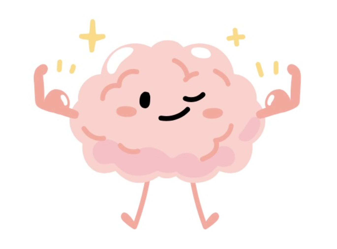
Mind Matters original character
Rack Card
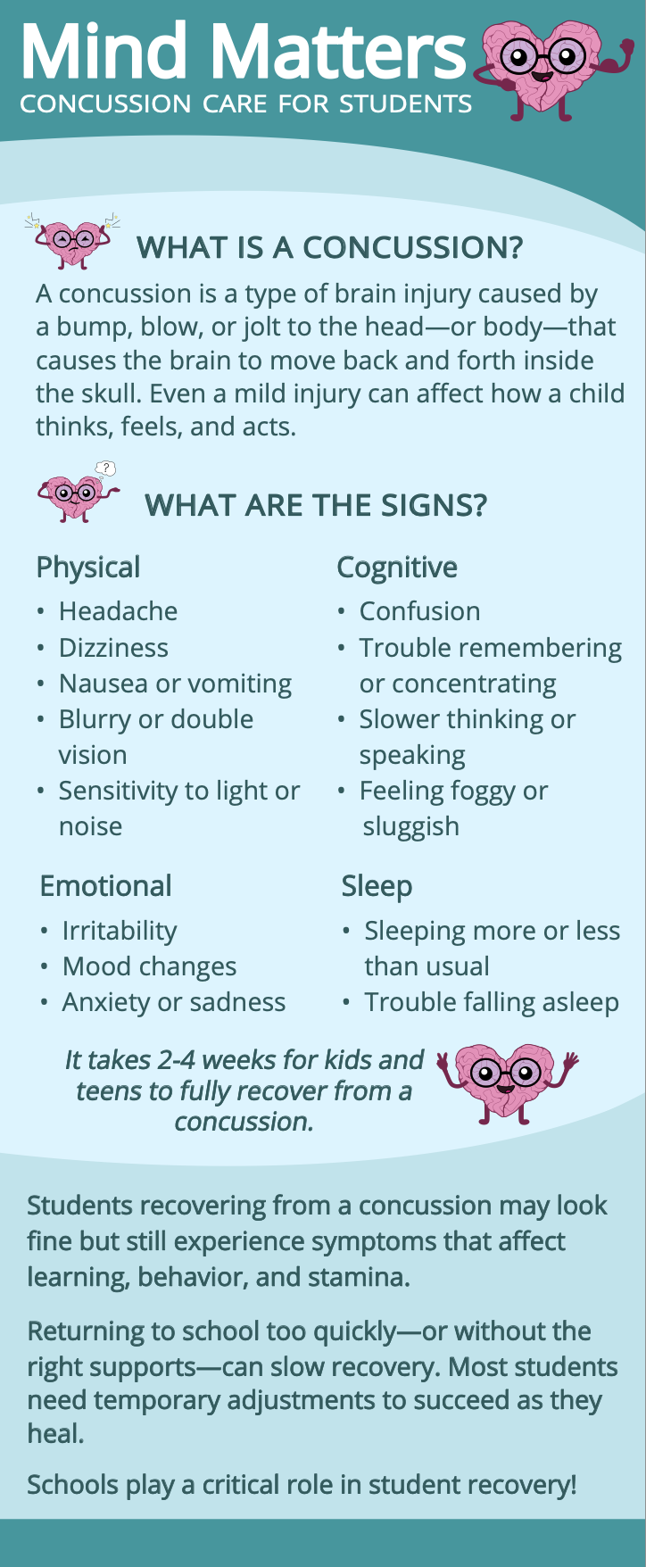
front
back
Rack Card Approach
the rack card mainly targets the teacher, coach, and parent audience. the original rack card felt jumbled and lacked visual interest. my solution was to clearly define each section and increase the font size for easier readability; to do this, i used the character logotype and its variations. this lets it feel more lighthearted without undercutting the seriousness of the topic.
Informational Poster
Poster Approach
this poster was intended to be hung up in schools, so it targets students more directly. with this in mind, i used fairly simple and straightforward language and focused the content on the most important basics: what a concussion is, how it happens, common symptoms, prevention tips, and what to do if a student thinks they have one.
Sticker Design
Sticker Approach
i designed the sticker with the idea that kids could put it directly on their bike helmets, since the client noted that a lack of daily helmet use was one of the easiest ways for kids to get a concussion. i aimed to keep the design simple and kid-focused, but still visually engaging.
Instagram Carousel
Instagram Approach
for the instagram layout, i kept the design simple and intentionally less informational, aiming to spark curiosity and interest rather than deliver a full breakdown, so viewers would want to learn more about the program.
About the Program
Brain Injury Connections of the Shenandoah Valley (BICSV) is a nonprofit organization that supports individuals and families affected by brain injury throughout the Shenandoah Valley. their Mind Matters program focuses specifically on youth concussion education, helping students, parents, educators, and coaches recognize symptoms, understand prevention, and learn how to support a student's safe return to school and activities after an injury.
Big Idea
this project was created as a challenge to communicate a serious topic in a way that still felt fun and approachable; not so serious that it would bore or overwhelm the student audience, but not so lighthearted that it would undercut the trust of the parents, teachers, and coaches relying on it. i kept coming back to the idea of nostalgia and warmth, something that felt welcoming to people of all ages, and let that guide my creative solutions.
Creative Approach
my solution was guided by the client's notes on what wasn't working in their existing materials and character logotype. the client wanted a character that felt more "kawaii," more adaptable, and more visually interesting than their original character. i focused on using color, type, layout design, and overall energy across all deliverables in order to create visual cohesion that appeals to an audience with a wide age range.